Arcane Fun Fridays

WHEW! All of this WPF / XAML sure has been a lot of fun. But I think it’s time to come up for air and see what else is happing out there in Dot Net land.

Alabama Code Camp is coming up in just a little over a week, Saturday October 6th to be exact. Still plenty of time to register and even just a bit of time if you want to get in on the Silverlight programming contest. First prize for that is a Zune! http://www.alabamacodecamp.com/home.html

devLink, the large conference for a cheap price comes up right afterward in Nashville, Friday and Saturday October 12th and 13th. http://www.devlink.net/ . You can tell I’ll be there, my name’s on the front page as a winner of a Barnes and Nobel gift card (look for the dude from AL !)

(By the way, anyone know of a good dog repellent? My nephew is coming to house sit and is bringing Marshmallow and Buttercup, his twin Dobermans along because I have a big back yard they can play in. Last time though they ate the garden hose, chewed the handle off my shovel, and bit through one of my lawnmower tires.)

There’s a new add-on for SQL Server Management Studio I’m eager to try out. It’s still in Beta but looks promising. It was blogged about at http://weblogs.sqlteam.com/mladenp/archive/2007/09/20/SSMS-Tools-Pack—an-add-in-for-SQL-Management-Studio.aspx or you can download it directly at http://www.ssmstoolspack.com/ .

If you are a fan of NUnit, you’ll appreciate the new xUnit. Read James’ announcement at http://jamesnewkirk.typepad.com/posts/2007/09/announcing-xuni.html .

In a recent Dot Net Rocks episode, Carl Franklin announced they would be taking over Shrinkster.com. Shrinkster has been down due to spam abuse, as soon as Carl gets everything setup we’ll be able to go back to using short links again!

Speaking of Dot Net Rocks, I especially enjoyed show 274, where the new features of VB.Net and C# for the 2008 release were discussed. Entertaining and lots of good tidbits. I think my favorite feature so far has got to be C#’s extension methods. http://www.dotnetrocks.com/default.aspx?showNum=274

During my long drive to the Tallahassee Code Camp last week, I put together a podcast theme session, and copied a bunch of related podcasts onto my cheapo SanDisk mp3 player. This time I went with a “Millenator” theme and got all the episodes of Dot Net Rocks that Mark Miller appeared on. Good stuff, lots of thoughtful material combined with some humor. Next time you go on a trip, copy a bunch of past episodes of your favorite podcast that are in the same theme and make that long drive go much quicker.

There have been several updates to the world’s greatest Visual Studio Add-In, CodeRush, over the last few weeks ( http://www.devexpress.com/Home/Announces/CodeRush25.xml ). Apparently Mark Miller and the boys have been busy! If you’re not on 2.5.4 go update yours today.

Speaking of Mark Miller, I love his intro slide for his VSLive session coming up in LasVegas. Take a look, pure genius. http://www.doitwith.net/2007/09/11/MyLastVSLiveSessionEver.aspx

A final note, between getting ready for Alabama Code Camp and going to devLink my blogging may get spotty for the next few weeks, bear with me and I’ll have full reports from both code camps and lots of fun new stuff to share.

WPF Menus

The next control in the basic toolkit is the menu. Menus are much like a series of nested buttons in the way you deal with them. Let’s create a simple menu. I’ve added a DockPanel, so we could nest our menu at the top, a very common scenario.

  <DockPanel>

    <Menu DockPanel.Dock=Top >

      <MenuItem Header=_File>

        <MenuItem Header=_Open />

        <MenuItem Header=_Save />

        <MenuItem Header=Save As… />

        <MenuItem Header=E_xit Click=mnuFileExit_Click />

      </MenuItem>

      <MenuItem Header=_Edit>

        <MenuItem Header=_Cut />

        <MenuItem Header=C_opy />

        <MenuItem Header=_Paste />

      </MenuItem>

      <MenuItem Header=_Help>

        <MenuItem Header=_About />

        <MenuItem Header=_Contents />

        <MenuItem Header=_Help />

      </MenuItem>

    </Menu>

  </DockPanel>

wpf054

The underscore acts as an indicator to underline in the menu, designating a “hot key”. When the user hits the ALT key, they are then able to combine with the hot key to activate the menu option. ALT+F opens the File menu, O will then trigger the open.

Responding to the users click is just like working with many other controls, simply add a Click=”” in the MenuItem. Above you will notice I did this for one item, the Exit menu choice under File. Here’s the code I created in C#:

    void mnuFileExit_Click(object sender, RoutedEventArgs e)

    {

      this.Close();

    }

Since all the other menus work the same way I won’t bother to wire them up, but you get the idea.

It’s also possible to insert a separator, a visual line the separates one menu option from the rest. In this example, I think Exit should be separated from the other options.

  <!– …snip… –>

  <MenuItem Header=_File>

    <MenuItem Header=_Open />

    <MenuItem Header=_Save />

    <MenuItem Header=Save As… />

    <Separator></Separator>

    <MenuItem Header=E_xit Click=mnuFileExit_Click />

  </MenuItem>

  <!– …snip… –>

And now we have a nice clean line across the menu:

wpf055

OK, I can hear you now, “Hey, this is WPF, what about all the pretty pictures?” No problem, the menus support the addition of icons to each item.

One thing I’ve found many developers don’t realize is that Visual Studio actually ships with a nice array of graphics for your use. If you are using Visual Studio 2005, navigate to the C:\Program Files\Microsoft Visual Studio 8\Common7\VS2005ImageLibrary folder. There you will find a zip file named VS2005ImageLibrary.zip.

I extracted the icons folders to my D drive, as you’ll notice in the next code snippet. Adjust the sample according to where you decide to put them. I did find that on Vista, I needed to move them out of my Program Files folder or they didn’t render correctly, a security permissions issue.

      <MenuItem Header=_File>

        <MenuItem Header=_Open >

          <MenuItem.Icon>

            <Image Height=16 Width=16

              Source=D:\Icons\WinXP\folderopen.ico />

          </MenuItem.Icon>

        </MenuItem>

        <MenuItem Header=_Save >

          <MenuItem.Icon>

            <Image Height=16 Width=16

              Source=D:\Icons\Win9x\DISK06.ico />

          </MenuItem.Icon>

        </MenuItem>

        <MenuItem Header=Save As… />

        <Separator></Separator>

        <MenuItem Header=E_xit Click=mnuFileExit_Click />

      </MenuItem>

For the MenuItems I wanted to add icons to, I need to define the MenuItem.Icon tag, then inside place an Image. The Source property I set to files I’d mentioned earlier. Note also I explicitly set the Height and Width to 16×16, in order to make them fit nicely into the menu. However, you are free to make them any size you wish, the menu item height will adjust automatically to compensate.

wpf056

Ah, a work of art even Leonardo da Vinci would be proud of. But our artistic menus are not limited to the the top of the Window. It’s also possible to attach a menu to nearly any control, in the form of a ContextMenu. ContextMenus appear when you Right Click with the mouse on the control.

  <DockPanel>

    <Menu>

    <!–Menu omittied for brevity, same as previous–>

    </Menu>

    <Grid>

      <Grid.RowDefinitions>

        <RowDefinition></RowDefinition>

        <RowDefinition></RowDefinition>

      </Grid.RowDefinitions>

      <Grid.ColumnDefinitions>

        <ColumnDefinition></ColumnDefinition>

        <ColumnDefinition></ColumnDefinition>

      </Grid.ColumnDefinitions>

      <TextBlock Grid.Row=0

                Grid.Column=0

                Grid.ColumnSpan=2>

        Enter some text, right click for menu options.

      </TextBlock>

      <TextBox Grid.Row=1 Grid.Column=0>

        <TextBox.ContextMenu>

          <ContextMenu>

            <MenuItem Header=_Cut />

            <MenuItem Header=C_opy />

            <MenuItem Header=_Paste />

            <Separator></Separator>

            <MenuItem Header=_Save >

              <MenuItem.Icon>

                <Image Height=16 Width=16

                  Source=D:\Icons\Win9x\DISK06.ico />

              </MenuItem.Icon>

            </MenuItem>

          </ContextMenu>

        </TextBox.ContextMenu>

      </TextBox>

    </Grid>

  </DockPanel>

I’m adding a Grid to the body of the DockPanel. In the Grid I’m putting a TextBlock with some instructions, then a TextBox. Try right clicking on the TextBox, and take a look at what you get:

wpf057

To get this to work, I first had to create a ContextMenu tag specific for the control, in this case TextBox.ContextMenu. Within that tag I was then able to place my ContextMenu. Inside it I treated it just like a normal Menu control, the code in there I simply copied from the other menus. I could even have the Click events route to the same code in the code behind module if I wished.

It’s worth pointing out that a menu may appear anywhere on the Window. Here I will create a menu to the right of the TextBox, in the next column of the Grid.

  <DockPanel>

    <Menu DockPanel.Dock=Top >

      <!–Omitted, see previous–>

    </Menu>

    <Grid>

      <!–Omitted, see previous–>

      <TextBox Grid.Row=1 Grid.Column=0>

        <!–Omitted, see previous–>

      </TextBox>

      <Menu Grid.Row=1 Grid.Column=1>

        <MenuItem Header=Load>

          <MenuItem Header=From File></MenuItem>

          <MenuItem Header=From Database></MenuItem>

        </MenuItem>

        <MenuItem Header=Reset>

          <MenuItem Header=This Item />

          <MenuItem Header=Entire Form />

        </MenuItem>

      </Menu>

    </Grid>

  </DockPanel>

wpf058

The menu code is the same as before, except I located in the Grid instead of at the top of the Window.

Virtually any application of decent size will need to employ a menu structure of some kind. Getting to know the basics of menu controls will get you ready for that first big WPF app.

WPF Tab Control

Continuing the series on visual grouping controls in WPF, the Tab control is a common UI element that has been around for some time. It makes a convenient way to organize your window when there is more than could realistically fit and still be comprehensible.

In WPF, Tabs are very easy to implement. Create a new WPF Window, remove the default Grid tags, and add the following XAML:  

  <TabControl>

    <TabItem Header=Tab 1>Here’s Tab 1</TabItem>

    <TabItem Header=2nd Tab>A second Tab</TabItem>

  </TabControl>

Run the app, and you’ll see the two tabs on a window:

wpf042

The TabItem, just like most controls, can hold a container control that can hold much more, thus making the tab really useful. In this example, let’s add a third tab item, with a grid. We’ll put in a few text boxes and a button.

  <TabControl Name=tabMyTabs >

    <TabItem Header=Tab 1>Here’s Tab 1</TabItem>

    <TabItem Header=2nd Tab>A second Tab</TabItem>

    <TabItem Header=Cool Tab>

      <Grid>

        <Grid.RowDefinitions>

          <RowDefinition></RowDefinition>

          <RowDefinition></RowDefinition>

          <RowDefinition></RowDefinition>

        </Grid.RowDefinitions>

        <Grid.ColumnDefinitions>

          <ColumnDefinition Width=*></ColumnDefinition>

          <ColumnDefinition Width=2*></ColumnDefinition>

        </Grid.ColumnDefinitions>

        <Label Grid.Column=0 Grid.Row=0

              HorizontalAlignment=Right>

          First Name:

        </Label>

        <Label Grid.Column=0 Grid.Row=1

              HorizontalAlignment=Right>

          Last Name:

        </Label>

        <TextBox Name=FirstName

                Grid.Column=1

                Grid.Row=0 />

        <TextBox Name=LastName

                Grid.Column=1

                Grid.Row=1 />

        <Button  Grid.Column=1

                Grid.Row=2

                Height=23 Width=75

                HorizontalAlignment=Left

                Name=CoolTabButton

                Click=CoolTabButton_Click

                VerticalAlignment=Top>

          OK

        </Button>

      </Grid>

    </TabItem>

  </TabControl>

Using techniques already described in my post on Grids (https://arcanecode.wordpress.com/2007/08/28/grid-yourself-its-wpf/ , in case you missed it) I was able to create a tab with some useful content. Running it, you can see the results for yourself:

wpf043

It’s also possible to determine the current tab via code. Let’s wire up a click event to that OK button you see. This requires we name the tab (I called it tabMyTabs), and the button, and add a Click=”CoolTabButton_Click” to the button declaration. Now all we have to do is add a little code:

    private void CoolTabButton_Click(object sender, RoutedEventArgs e)

    {

      TabItem ti = tabMyTabs.SelectedItem as TabItem;

      MessageBox.Show(“Tab Index=” + ti.Header);

    } 


Running and clicking on the OK button will result in a message box with the words “Tab Index=Cool Tab”

Granted my design won’t win any awards, but it gives you the general idea of how to use a tab control in WPF.

WPF Expander

Last Friday I discussed the GroupBox as a way to organize and sets of controls into distinct groups. There are several controls that will allow you to group controls, so today I’d like to highlight another named the Expander.

The expander is a nifty control that will allow you to show and hide the controls you place on it. Let’s start by putting an Expander control onto a Window. Inside we’ll add a StackPanel, and in it I’ll copy a couple of the RadioButtons from last week’s examples.

<Expander>

    <StackPanel>

      <RadioButton GroupName=One IsChecked=True>Option 1</RadioButton>

      <RadioButton GroupName=One IsChecked=False>Option 2</RadioButton>

    </StackPanel>

  </Expander>

wpf049

Sort of uninspiring, just that button sitting there. But click it and the magic happens.

wpf050

The arrow is nice, but it’d be nice to know what the expander is supposed to do. To that end the Header property is provided. Let’s expand our example with a second Expander control.

  <StackPanel>

    <Expander>

      <StackPanel>

        <RadioButton GroupName=One IsChecked=True>Option 1</RadioButton>

        <RadioButton GroupName=One IsChecked=False>Option 2</RadioButton>

      </StackPanel>

    </Expander>

    <Expander Header=Expander Header>

      <StackPanel>

        <TextBlock>Here is some instructional text for your viewing pleasure.</TextBlock>

        <CheckBox>Check me out!</CheckBox>

      </StackPanel>

    </Expander>

  </StackPanel>

wpf051

Here you can see the group header named “Expander Header”. You may notice, however, that the text scrolls off the side of the screen. That’s easy enough to fix though, all we have to do is add TextWrapping=Wrap” to the TextBlock, which you’ll see in the next sample.

Speaking of which, you may decide there are times when you want to have the Expander control already open when the dialog appears. The most common scenario would be with additional instructions for the user. Perhaps your program has modes for new users and experts. In “new user” mode, you want these to appear already expanded, but in “expert” mode they should not appear. Easy enough to achieve with the IsExpanded property.

  <StackPanel>

    <Expander>

      <StackPanel Margin=15,3,1,1>

        <RadioButton GroupName=One IsChecked=True>Option 1</RadioButton>

        <RadioButton GroupName=One IsChecked=False>Option 2</RadioButton>

      </StackPanel>

    </Expander>

    <Expander Header=Expander Header>

      <StackPanel>

        <TextBlock TextWrapping=Wrap>Here is some instructional text for your viewing pleasure.</TextBlock>

        <CheckBox>Check me out!</CheckBox>

      </StackPanel>

    </Expander>

    <Expander IsExpanded=True Header=Expanded to start with>

      <TextBlock TextWrapping=Wrap>Expanded using the IsExpanded property</TextBlock>

    </Expander>

  </StackPanel>

Here is the dialog, just as it appears to the user when it’s first run.

wpf052

Play around with the other two headers as well. You’ll notice I added a Margin tag to the first group, to bump the options over a bit and make them look a little nicer. I also added the TextWrapping tags to the various TextBlocks.

Finally, you may not always want the Expander to expand down. Fear not, it’s possible to have the expansion go to the right, left, or up via the ExpandDirection tag. Getting it to look right, however, is not a straight forward task. Let’s take a look at what I want to achieve.

wpf053

As you can see, I have a button, and to the right of the button is the expander control, with the ExpandDirection set to Right. You might think you could just drop them into a Horizontally aligned StackPanel, but it won’t work. The StackPanel just expands to take up the room it needs, even if that means going off the edge of the form. The TextWrapping property then of the TextBlock is useless, since it’s container, the StackPanel, seems to be wide enough. It’s not looking at the Window.

There are a couple of ways we could solve this, such as tieing the width of the StackPanel to the Window. But the most straightforward way is to not use the StackPanel at all, but instead to use a Grid.  

  <StackPanel>

    <!–First 3 Expanders omitted for brevity–>

    <Grid>

      <Grid.ColumnDefinitions>

        <ColumnDefinition Width=47></ColumnDefinition>

        <ColumnDefinition></ColumnDefinition>

      </Grid.ColumnDefinitions>

      <Grid.RowDefinitions>

        <RowDefinition></RowDefinition>

      </Grid.RowDefinitions>

      <Button Grid.Column=0 Height=25 VerticalAlignment=Top HorizontalAlignment=Left>Button</Button>

      <Expander Grid.Column=1 ExpandDirection=Right>

        <TextBlock TextWrapping=Wrap Margin=5,3,3,3>Expanded to the right using the ExpandDirection property gives interesting possibilities</TextBlock>

      </Expander>

    </Grid>

    <TextBlock>Some text just below the Right Expander</TextBlock>

  </StackPanel>

Here you can see a grid with one row and two columns. Note in the grid, I’ve fixed the width of the first column to be a good size for the button. If that’s not done, the Grid will keep changing size as the Window changes, and thus changing the button width which gets rather disconcerting to the user, who typically expects buttons to remain a constant size.

In addition, in the Button control I set a fixed height, again to avoid the resize issue. I’ve also set the alignment to the upper left, otherwise the button will move around as the Expander is opened and closed.

Now for the heart of all this, in the Expander control I set the ExpandDirection to Right, so it will go in the direction I want.

Within the TextBlock I added a slight margin to the TextBlock, to make it appear a little nicer. Finally I put another TextBlock under the Grid in the StackPanel, just so you could see it move up and down with the Expander.

Expander controls have a lot of possibilities with WPF. I’ve already mentioned the instructions scenario for new / expert users. They could also be used to hide seldom used options. Expression Blend uses these over in the properties window. If you come up with new design possibilities for this control, feel free to post a comment and let us know what you came up with.

Tallahassee Code Camp A Blast!

I got home a little while ago from spending all day Saturday at the Tallahassee Code Camp. And I have to say, it was a blast! Despite a six hour drive, which included driving through the remains of a tropical storm, it was well worth my time.

The day opened with me actually giving a presentation on SQL Server 2005 Compact Edition. I always like giving my presentations in the first slot, as the attendees are awake (mostly) and energized (or at least heavily caffeinated). They typically ask great questions, and this group was no exception. After my presentation, I was able to spend the rest of the day relaxing and learning about all sorts of great technologies. I attended sessions on Silverlight, LINQ, Windows WorkFlow (WF), and Ajax. All great, and very informative.

The Tallahassee User Group really knows how to put on a good show. Registration was extremely fast, they had more than enough doughnuts and coffee at breakfast and great pizza at lunch. The rooms were nice, all in all quite well run.

And the swag, baby! I have to brag and say I scored some great stuff, primarily a stack of new books on various .Net 3.0 technologies. My best score though came from Joe Healy (http://www.devfish.net/) who gave me one of those cool oval Microsoft stickers which I’ve now proudly affixed to the top of my laptop, just under my Coding Horror sticker.

I also have to give and extra special thanks to my long suffering wife the Southern TinkerBelle ( http://southerntinkerbelle.com/ ), who bent over backwards to arrange things so I could attend. Thanks sweetie!

Thanks again to everyone for a great time, and I look forward to going back next year!

WPF GroupBox

In yesterday’s discussion on RadioButtons, I mentioned it would be a good idea to give a visual cue to the users that certain buttons were associated with each other. The GroupBox is one such way of doing that.

Let’s go back to the RadioButton example from yesterday. You’d think all that’s needed is to surround our sets of radio buttons with the <GroupBox> tags. Unfortunately, the GroupBox can only have one child in it’s content, hence the need to insert a StackPanel, Grid, or other container control.

  <StackPanel>

    <GroupBox>

      <StackPanel>

        <RadioButton GroupName=One IsChecked=True>Option 1</RadioButton>

        <RadioButton GroupName=One IsChecked=False>Option 2</RadioButton>

      </StackPanel>

    </GroupBox>

    <GroupBox>

      <StackPanel>

        <RadioButton GroupName=Two IsChecked=False>Option 3</RadioButton>

        <RadioButton GroupName=Two IsChecked=True>Option 4</RadioButton>

      </StackPanel>

    </GroupBox>

  </StackPanel>

Produces

wpf046

If you look carefully, you can see thin lines surrounding each set of buttons. You can go further and add headers to the GroupBox frame.

  <GroupBox Header=Group One>

Adds a header to the first box.

wpf047

You can even go further, and add true content to the header area. Here we’ll add a button.

  <StackPanel>

    <GroupBox Header=Group One>

      <StackPanel>

        <RadioButton GroupName=One IsChecked=True>Option 1</RadioButton>

        <RadioButton GroupName=One IsChecked=False>Option 2</RadioButton>

      </StackPanel>

    </GroupBox>

    <GroupBox>

      <GroupBox.Header>

        <Button>Group Two</Button>

      </GroupBox.Header>

      <StackPanel>

        <RadioButton GroupName=Two IsChecked=False>Option 3</RadioButton>

        <RadioButton GroupName=Two IsChecked=True>Option 4</RadioButton>

      </StackPanel>

    </GroupBox>

  </StackPanel>

Gives us

wpf048

Using a GroupBox can be a simple but visually appealing way to organize your visual elements.

The WPF RadioButton

Being an old VB coder, I fondly remember this control as the Option Button, but these days it’s been renamed to the RadioButton. They are used to present the user with a set of mutually exclusive options.

Adding them is simple, just use the <RadioButton> tag. For the button you wish to be the default (if any) you add the IsChecked=”true” flag.

WPF adds a huge improvement over it’s predecessor. No longer are you forced to use a container control to group your radio buttons. Instead, WPF adds a GroupName property. Take a look at this example:  

  <StackPanel>

    <RadioButton GroupName=One IsChecked=True>Option 1</RadioButton>

    <RadioButton GroupName=One IsChecked=False>Option 2</RadioButton>

    <RadioButton GroupName=Two IsChecked=False>Option 3</RadioButton>

    <RadioButton GroupName=Two IsChecked=True>Option 4</RadioButton>

  </StackPanel>

wpf045

Note the GroupName, for the first two items, I’ve set it to One, on the second two it’s Two. This means you can change Option 1 and Option 2 without affection Options 3 or 4. Go ahead and run the app, click on the options a bit and watch what happens.

In my example, I only entered two items for each, the actual number you can do is limited only by the space you have available on your Window.

The C# code for checking the value is identical to yesterday’s code for the CheckBox so I won’t reiterate it, all you have to do is look at the IsChecked property.

One last point, event though adding containers are not required to separate the option groups, it’s important to provide some sort of visual indicator so the user knows which groups do what.

The WPF ComboBox

The other major listing control to cover is the ComboBox. It turns out that they are almost identical to ListBoxes. This simple code will add a combo box to your container (I’m using a StackPanel) and put two items into it.

      <ComboBox>

        <ComboBoxItem>Item 1</ComboBoxItem>

        <ComboBoxItem>Item 2</ComboBoxItem>

      </ComboBox>

Running will produce the predictable window with a drop down combo box and two items. If you want the user to be able to edit or enter his own text, you will need to set the IsEditable property to true and IsReadOnly to false in the <ComboBox> header.

Also like the ListBox, the ComboBox can contain complex items.

      <ComboBox>

        <ComboBoxItem>

          <StackPanel Orientation=Horizontal>

            <TextBlock Width=100>Anna</TextBlock>

            <Image Source=D:\Presentations\100Anna.jpg Height=100 />

          </StackPanel>

        </ComboBoxItem>

        <ComboBoxItem>

          <StackPanel Orientation=Horizontal>

            <TextBlock Width=100>Raven</TextBlock>

            <Image Source=D:\Presentations\100Rave.jpg Height=100 />

          </StackPanel>

        </ComboBoxItem>

        <ComboBoxItem>

          <StackPanel Orientation=Horizontal>

            <TextBlock Width=100>Ammie</TextBlock>

            <Image Source=D:\Presentations\100Ammie.jpg Height=100 />

          </StackPanel>

        </ComboBoxItem>

        <ComboBoxItem>

          <StackPanel Orientation=Horizontal>

            <TextBlock Width=100>Kids</TextBlock>

            <Image Source=D:\Presentations\100Kids.jpg Height=100 />

          </StackPanel>

        </ComboBoxItem>


      </ComboBox>

wpf040

Note from the image above, if the contents of the drop down are too big it wil drop below the bottom of your current Window. Additionally, if you use automatic sizing the combo box will adjust itself rather oddly depending on the contents. For that reason, you may wish to set a default width rather than letting the combo box do it for you.

So how do we get data back out of the ComboBox? Well, if all we have is text, we can do just like we did with the ListBox, convert the selected item to a combo box item and get it’s Content.ToString property. But what if it’s like the above example, a mixture of text and images? Well we have to dig just a little, but it’s not that difficult if you understand the tree WPF creates.

  <StackPanel>

    <ComboBox Name=myComboBox  >

      Item Data Omitted for Brevity

    </ComboBox>

    <Button Name=myButton Content=OK Click=myButton_Click />

  </StackPanel>

Note I made two changes. First I added a name to the ComboBox, that way I can address it in code. Next I added a simple button control, we’ll use it to show what is currently selected. Just for the fun of it, I used the Content tag instead of placing it between the <Button></Button> tags, you may run across that form of syntax at some point and should be aware of it.

Now we need to add a little code to the myButton_Click event.

    public void myButton_Click(object sender, RoutedEventArgs e)

    {

      ComboBoxItem cbi = myComboBox.SelectedItem as ComboBoxItem;

      if (cbi != null)

      {

        StackPanel sp = cbi.Content as StackPanel;

        TextBlock block = sp.Children[0] as TextBlock;

        MessageBox.Show(“You picked “ + block.Text);

      }

      else

      {

        MessageBox.Show(“You haven’t picked anything yet”);

      }

    }

First, I got the current ComboBox item, and stored it in the cbi variable. I then check to see if it’s null, which it will be if the user hasn’t selected anything. If it is, we can show them the traditional “hey dummy” message, as I did in the else clause.

If you recall, the contents of the ComboBoxItem are a StackPanel control, so next I get a reference to it in the sp variable.

Next, I suppose I could iterate of the Children of the StackPanel, but since I know that the TextBlock I want is the first child, I’ll simply reference it directly as element zero and return it to the block variable.

Finally we can get to the actual text for the row the user picked. We can simply reference the TextBlock’s text property in the message box. When the app is run, you should see these results:

wpf041

The same techniques I use here would also be applicable to the ListBox we’ve seen previously, simply replace ComboBoxItem with ListBoxItem.

The WPF ComboBox can be quite useful for providing a compact way for users to select complex items.

TouchCursor 1.3 Released

If you’re not familiar with TouchCursor, it’s a great utility for turning the “home” keys (keys like i, j, k, l, etc) into up arrow, left, down, right, etc. For my initial review, see my post at https://arcanecode.wordpress.com/2007/05/11/arcane-software-touchcursor-for-us-keyboard-geeks/

Now, I have an incredible story of customer service to share. Late last Saturday night I was on the forums on Scott Hanselman’s site ( http://www.hanselman.com/forum/ ) and was having a ‘conversation’ with someone in the Productivity Tools area on TouchCursor. I wondered aloud how hard it would be to change the activiation key from the spacebar to something user assignable. So I shoot off an e-mail to the support site and head off to bed.

When I wake up Sunday, I have an e-mail from the author saying he didn’t think it would be all that hard, it’d be more work getting all the help updated. I thanked him and since I’d made the suggested offered to do any beta testing. And off I went thinking it’d be a while.

I get home from work Monday, to find an e-mail with a link to the Beta version of TouchCursor! Gleefully I download and test away, finding no issues and trying a variety of activation keys.

And what a list! Check this out, and this is just a sample:

touchcursor_activation_options

For now I’m trying caps lock as my activation key because I seldom use it, and it’s close to my pinky just between shift and tab. Seems the most natural so far. But to get back to my story…

I reported my results back, and on Wednesday morning got the e-mail the new version had been released! Talk about swift response.

Take a look for yourself, download the current version at http://touchcursor.com/ . It’s shareware, so you can try it before you buy, and buying is pretty painless, a mere twenty dollars (US). There’s even a “no install” version, in case you want to run it as a portable app from your USB drive.

TouchCursor has made it to the short list of must have tools in my arsenal. After service packs, virus protection and firewalls it’s one of the first things that gets installed. I challenge you to try it for 30 days and see if you don’t get hooked!

Standard Disclaimer: I have no financial association with Rare Pebble Software, other than having purchased the TouchCursor software. Just a very satisfied customer.

Adding WPF Controls Progrrammatically

On August 29th I wrote a posting about the StackPanel (https://arcanecode.wordpress.com/2007/08/29/stacking-the-deck-with-the-wpf-stackpanel/). A commentor asked “how do you add controls programmatically?” Good question, and it turns out to be quite easy.

Let’s create a sample app, and add a new window. I named mine AddControls. Here’s the XAML:

<Window x:Class=WPFSample001.AddControls

    xmlns=http://schemas.microsoft.com/winfx/2006/xaml/presentation

    xmlns:x=http://schemas.microsoft.com/winfx/2006/xaml

    Title=AddControls Height=114 Width=212

    >

  <StackPanel Name=splMain>

    <Button Name=btnAddMore Click=btnAddMore_Click>Add Another</Button>

  </StackPanel>

</Window>

And here’s what it looks like:

wpf029

A few things I’d like to point out. I’ve given a name to the StackPanel, so it can be manipulated in our C# code. I also added a handler for the Click event for the button, btnAddMore_Click. I also named the button, although it really wasn’t necessary for this sample.

OK, make sure to build the app so intellisense will work, then let’s jump to the C# code behind. (You may get an error about the click handler for the button not being found, that’s fine just ignore it.)

First, we’ll create an event handler for the button, passing in the sender and routed event args, like I discussed yesterday (https://arcanecode.wordpress.com/2007/09/05/the-wpf-button/) . Then, all we have to do is create a button control and add it to the children collection of the StackPanel, like so: 

    public void btnAddMore_Click(object sender, RoutedEventArgs e)

    {

      System.Windows.Controls.Button newBtn = new Button();

      newBtn.Content = “A New Button”;

      splMain.Children.Add(newBtn);

    } 


Note in this example I used the fully qualified System.Windows.Controls, I did that just to be explicit where the Button came from. After a new button is created, I set it’s Content property, which in this case will be the text on the button.

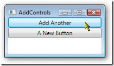
In the final line, I add it to the children collection of the StackPanel. When you run it, and press the “Add Another” Button, you will see:

wpf030

Now we have a new problem. We’ve added a button to the StackPanel, but clicking on it does no good as we haven’t tied it to an event handler. Turns out that’s pretty easy too.

    public void btnAddMore_Click(object sender, RoutedEventArgs e)

    {

      System.Windows.Controls.Button newBtn = new Button();

      newBtn.Content = “A New Button”;

      newBtn.Click += new RoutedEventHandler(newBtn_Click);

      splMain.Children.Add(newBtn);

    }


What I did was use a delegate. I added a new RoutedEventHandler and tied it to the click event. The code for the event is in a method named newBtn_Click:

    private void newBtn_Click(object sender, RoutedEventArgs e)

    {

      MessageBox.Show(“New Button Clicked!”, “I got pressed.”);

    }


The signature for the event handler has to match the signature for a Click event, since that’s what we’re routing to. Here, all I do is display a message box just so you can see something got done. Run it again and press the Add Another button, and the “A New Button” should appear. Press the new button and you should see a message box.

wpf031

Finally, I want to be clear you can use this technique to add any sort of control. Here I’ve added a Label as well as a button:

    public void btnAddMore_Click(object sender, RoutedEventArgs e)

    {

      System.Windows.Controls.Button newBtn = new Button();

      newBtn.Content = “A New Button”;

      newBtn.Click += new RoutedEventHandler(newBtn_Click);

      splMain.Children.Add(newBtn);


      System.Windows.Controls.Label newLbl = new Label();

      newLbl.Content = “Hi Mom!”;

      splMain.Children.Add(newLbl);

    }

wpf032

I could have created the entire form in C# (or VB.Net) code, adding the StackPanel directly to the “this” object. However, that gets a bit laborious, and I wouldn’t recommend it as a general practice.

Arcane Searching

I think we’d all agree the internet is one of the greatest productivity tools around, allowing us to find vast stores of information. I’m sure you’ve also heard it’s the greatest time waster, with lots of distracting sites or useless pages that get in the way of the results we want.

I find it really valuable to have a good search tool, one that focuses on the content I need, and limits the scope of the search to relevant areas. Of course we’ve all heard of Google, the 500 pound gorilla of search engines. While the do a pretty decent job, when your search phrase returns half a million hits it can be difficult to narrow down.

Recently I’ve found the Microsoft engine, Windows Live ( http://www.live.com/ ), has gotten a lot better, especially when looking for .Net related developer content.

My favorite so far though, is Search.Net ( http://searchdotnet.com/ ), a site put together by coding legend Dan Appleman. Dan ( http://www.desaware.com/ ) created a Google powered site, but maintains the list of sites it searches so you know that you are only combing sites devoted to programming and not Happy Harry’s House of Wild Women.

Another site I just learned about this week is Koders ( http://www.koders.com/ ). It’s a site devoted to searching through source code. It also has some helps that will let you zoom in on what you want. You can pick the language, or specify your search word needs to be in the class name, method name, or interface name. This kind of search is valuable when you are looking for an example, or trying to avoid reinventing the wheel.

A similar site is Krugle ( http://www.krugle.com/ ). It has similar paradigm to Koders, allowing you to search through code.

The final code search tool I’ll mention is Google’s new Code Search engine ( http://www.google.com/codesearch?hl=en ). It allows you to search using regular expression syntax, which is a nice feature (I just wish regular expressions weren’t such a pain in the underwear to use).

I have to give a quick thanks, most of these I learned about through either my listening of Dot Net Rocks ( http://www.dotnetrocks.com/ ) and HanselMinutes ( http://www.hanselminutes.com/ ) or through Scott Hanselman’s new forum site, which I blogged about yesterday.

Those are the list of place I go when I need to find something, how about you?

Just Code It

Jeff Atwood has an interesting post on his Coding Horror site entitled “Yes, But What Have You *Done*?” ( http://www.codinghorror.com/blog/archives/000809.html ). Programmers, Jeff says tend to be natural introverts, and left to their natural devices will migrate toward head down coding.

“But it is possible to go too far in the other direction, too. It’s much rarer, because it bucks the natural introversion of most software developers, but it does happen. Take me, for example. Sometimes I worry that I spend more time talking about programming than actually programming.”

I know how Jeff feels. In my role as a development lead I spend a lot of time in meetings, or talking to other developers about their projects. As a result I wind up spending a lot of time late at night doing coding, just to keep up with the latest and greatest techniques.

The need for code experience directly resulted in one of my “How To Be A Better Developer…” ( https://arcanecode.wordpress.com/2007/07/13/being-a-better-developer-in-6-months/ ) pledges.

I will work all the code samples in the book. Reading is one thing, but doing is even better. Personally, I find I get a better understanding when I actually type in the code samples and run them. And not just run what’s in the book, but tweak it, experiment with it.

I’m amazed at the number of times I meet some guy who comes across as a self proclaimed expert on a subject. When I quiz the person or try to ask tough questions, it turns out said individual read a book, but never actually wrote any code. Book learning is great, I certainly buy enough books every year to know, but there’s no substitute for doing.

When learning something new, start with the samples. Work it, tweak it, understand it. Then, if appropriate use it on your project at work. If it’s not appropriate, find someone else’s project that it would be a good fit for. Offer to work a few hours unpaid overtime and contribute some code to their project. They’d probably be grateful for the help, and might repay with some pointers and critiques.

Can’t find an appropriate project at work? There are thousands of open source projects out there, find one where you could contribute. Or look around the community; find a charity that needs some programming done.

It’s easier than you think to find some real world places to apply your coding skills. So what are you waiting for, just code it!

Microsoft Goes Open Source

For years critics have been blasting Microsoft over their proprietary standards and applications. Over the last few years, however, Microsoft has slowly been answering those critics by adopting internet standards instead of insisting on their own, and releasing more things to the community.

The ability to save Office 2007 documents as XPS comes to mind, as does the ability for CardSpace to use open standards like OpenID. Now, in their next step they are embracing the open source community through the addition of a new Open Source page within Microsoft.

http://www.microsoft.com/opensource/default.mspx

On this site you can find all sorts of information and resources for those wanting to do open source projects using Microsoft software. Links to articles, websites, and the Visual Studio Express editions can be found. I won’t try to reiterate the entire site here, but if you have an interest in Open Source it’s well worth your time to have a look.

In addition is another site called Port 25. It is the outreach site for Microsoft’s Open Source Software Lab. Some really cool stuff here on Linux interoperability, as well as the new Dynamic Language support such as IronRuby and IronPython.

http://port25.technet.com/

I can tell right now I’m going to be spending a lot of time on Port 25.

Finally, I should mention a site that’s been around for a bit by the name of CodePlex. It’s Microsoft’s site to host open source project done by both Microsoft folks and those of us in the community. (Well, I say us, one day I keep swearing I’ll find time to crank out some cool project and put it on CodePlex.)

http://www.codeplex.com/

Currently they show about 2000 projects right now, so there should be a lot for you to check out.

No, I don’t foresee Vista going open source anytime soon. But I really have to hand it to Microsoft. Somewhere over the last few years they realized they weren’t the only game in town. Since then they have really made an effort to “play nice” with other communities, and embrace many new open standards. The creation of their Microsoft Open Source site is just another step in that journey.

Arcane Add-Ins: KNOCKS Solutions VS 2005 Add-In

It’s been a while since I talked about Visual Studio add-ins, so when I ran across KNOCKS Solutions “Knocks VS2005 Add-In”, I knew I’d found the perfect subject. Available at http://www.knocks-solutions.com/VS2005Addins.aspx?sm=idVS20052 , this rather full featured add-in offers many utilities.

First is a personal clipboard, that allows you to store and retrieve up to 9 different items. And they’re persistent, they will stay between VS sessions.

Next is a code snippets manager. This seems a bit redundant in light of VS 2005’s snippets, but I can see it being very useful during a presentation.

In addition to the code snippets is a Notes module. I’ve often wished for the ability to store quick notes to use in a presentation, so this is a handy module.

Up next is the one tool of theirs I have a beef with, the “Re-arrange code” tool. I like the idea of being able to re-arrange my code. Often I’m working on some public method, and realize I need a private helper method and, being in a hurry and lazy, will drop it right under the public method. Later I’ll move it around, which was why I was excited to see this tool.

Sadly, it has a really bad side affect, it strips out any regions you’ve put into your code, and it strips out any comments that might lie between methods (I often put a comment header right above my method, instead of in the method.) When Knocks rearranges your code all of that goes into the bit bucket, making the tool useless in all but (perhaps) the very earliest stages of coding. I would have thought it possible to add regions to the tool as well, and allow code rearranging within a region, between regions, or even to move regions around. Perhaps this will be addressed in the next version (he said, ever full of eternal hope).

There is a nifty zip tool that will zip your entire project, handy for quick backups. Also is a tool that embraces the concept of a favorites for projects. Another tool is one I wonder why no one did sooner, a keyword search on Google (or other configurable search engine, like MS Live). This is one I’ll be using often.

Also included is a simple “Data Object” generator. You bring it up and enter a few property names and types and Knocks will create the basic class for you. While I have seen more full featured code generators, I appreciate the basic simplicity of this one, not to mention the price (which I’ll get to shortly).

knocks01The final two tools I’ll mention are my favorites. First is a Design Explorer. This adds an explorer window (I put mine with the Solution Explorer area) to your display. In it are all the controls for your current form. Clicking on the control not only makes it the active control in the designer, but displays the properties in the lower half of the Design Explorer window.


knocks02The other tool is the Code Explorer. It displays a tree of your current code module. Double clicking on the code element will take you to it in the code window.

I’ve seen other add-ins with code windows, this one seems equal in functionality with many others similarly priced.


Oh, did I forget to mention the price? It’s free. Yes, FREE. Knocks has packed a lot of functionality into this add-in, and the fact it’s free makes it well worth the time to download and learn.

Arcane Get-A-Ways

It’s always great to get away with your coworkers every so often, in a situation away from the office. That’s where I’ve been the last few days, in the mountains of north Georgia. Very pretty country, and our big team building event was a 6 mile canoe ride.  

Unfortunately there was no internet access in the lodge we were in. Seems it was being renovated and they hadn’t gotten around to hooking it back up. They barely got the new carpet installed before we arrived. (I was the first one there, and as I was walking in the carpet layer was driving away).

It was a weird experience being internetless for several days. It’s amazing how used to connectivity we’ve all become in such a short time.

Speaking of connectivity, I now have a Pownce account. http://pownce.com/arcanecode/ . I’ve only just started it, will try to figure out how to most effectively use it over the next few weeks. Meanwhile if you have a Pownce account feel free to send me a friend invite.

I also read that WordPress now has a good integration with Facebook, and am considering a Facebook account. Let me know your thoughts.

Finally, I’ve updated the Arcane Lessons page ( https://arcanecode.wordpress.com/arcane-lessons/ ) with more lesson plans, be sure to check it out.