WPF ListBox

Another old and faithful control that has made the transition to WPF is the ListBox. It’s pretty simple to create a ListBox, and load some values into it.

      <ListBox>

        <ListBoxItem>Item 1</ListBoxItem>

        <ListBoxItem>Item 2</ListBoxItem>

        <ListBoxItem>Item 3</ListBoxItem>

      </ListBox>

Of course the ListBox isn’t much good if you can’t get the value out of it. To do that we’ll have to add a few things.

      <Button Name=ShowSelected Click=ShowSelected_Click>Show Selected</Button>

      <ListBox Name=lbxDemo>

        <ListBoxItem>Item 1</ListBoxItem>

        <ListBoxItem>Item 2</ListBoxItem>

        <ListBoxItem>Item 3</ListBoxItem>

      </ListBox>


Here I added a button that would show which item was selected, then I had to give the ListBox a name we could refer to. Following techniques I’ve previously laid out (https://arcanecode.wordpress.com/2007/09/07/adding-wpf-controls-progrrammatically/) I added a click event for the button.

Now, you might think you could just enter something like

      MessageBox.Show(“You Selected “ + lbxDemo.SelectedValue);

And get a message back. But instead what you get is:


wpf033

This is because the SelectedValue is actually a ListBoxItem, and not a value. Instead you need to get the content of the ListBoxItem thusly:  

      ListBoxItem lbi = (lbxDemo.SelectedItem as ListBoxItem);

      MessageBox.Show(“You REALLY selected “ + lbi.Content.ToString());

Now you’ll see:

wpf034

Note that you’re not just restricted to ListBoxItems. I could, for example use checkboxes:

      <ListBox Name=lbxCheckMe>

        <CheckBox>Item 1</CheckBox>

        <CheckBox>Item 2</CheckBox>

        <CheckBox>Item 3</CheckBox>

        <CheckBox>Item 4</CheckBox>

      </ListBox>

wpf035

Like other controls, you can stack other controls inside the contents of a ListBoxItem. Let’s get a little fancy, and create a list box with both text and images.

      <ListBox Name=lbxCool>

        <ListBoxItem>

          <StackPanel Orientation=Horizontal>

            <TextBlock Width=100>Anna</TextBlock>

            <Image Source=D:\Presentations\100Anna.jpg Height=100 />

          </StackPanel>

        </ListBoxItem>

        <ListBoxItem>

          <StackPanel Orientation=Horizontal>

            <TextBlock Width=100>Raven</TextBlock>

            <Image Source=D:\Presentations\100Rave.jpg Height=100 />

          </StackPanel>

        </ListBoxItem>

        <ListBoxItem>

          <StackPanel Orientation=Horizontal>

            <TextBlock Width=100>Ammie</TextBlock>

            <Image Source=D:\Presentations\100Ammie.jpg Height=100 />

          </StackPanel>

        </ListBoxItem>

        <ListBoxItem>

          <StackPanel Orientation=Horizontal>

            <TextBlock Width=100>Kids</TextBlock>

            <Image Source=D:\Presentations\100Kids.jpg Height=100 />

          </StackPanel>

        </ListBoxItem>

      </ListBox>

    </StackPanel>

(Note you can use any images, I used a few of my kids and wife.) The result is this:

wpf036

This covers some basics on using a ListBox, enough to get you started with your own lists.

Adding WPF Controls Progrrammatically

On August 29th I wrote a posting about the StackPanel (https://arcanecode.wordpress.com/2007/08/29/stacking-the-deck-with-the-wpf-stackpanel/). A commentor asked “how do you add controls programmatically?” Good question, and it turns out to be quite easy.

Let’s create a sample app, and add a new window. I named mine AddControls. Here’s the XAML:

<Window x:Class=WPFSample001.AddControls

    xmlns=http://schemas.microsoft.com/winfx/2006/xaml/presentation

    xmlns:x=http://schemas.microsoft.com/winfx/2006/xaml

    Title=AddControls Height=114 Width=212

    >

  <StackPanel Name=splMain>

    <Button Name=btnAddMore Click=btnAddMore_Click>Add Another</Button>

  </StackPanel>

</Window>

And here’s what it looks like:

wpf029

A few things I’d like to point out. I’ve given a name to the StackPanel, so it can be manipulated in our C# code. I also added a handler for the Click event for the button, btnAddMore_Click. I also named the button, although it really wasn’t necessary for this sample.

OK, make sure to build the app so intellisense will work, then let’s jump to the C# code behind. (You may get an error about the click handler for the button not being found, that’s fine just ignore it.)

First, we’ll create an event handler for the button, passing in the sender and routed event args, like I discussed yesterday (https://arcanecode.wordpress.com/2007/09/05/the-wpf-button/) . Then, all we have to do is create a button control and add it to the children collection of the StackPanel, like so: 

    public void btnAddMore_Click(object sender, RoutedEventArgs e)

    {

      System.Windows.Controls.Button newBtn = new Button();

      newBtn.Content = “A New Button”;

      splMain.Children.Add(newBtn);

    } 


Note in this example I used the fully qualified System.Windows.Controls, I did that just to be explicit where the Button came from. After a new button is created, I set it’s Content property, which in this case will be the text on the button.

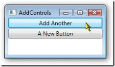
In the final line, I add it to the children collection of the StackPanel. When you run it, and press the “Add Another” Button, you will see:

wpf030

Now we have a new problem. We’ve added a button to the StackPanel, but clicking on it does no good as we haven’t tied it to an event handler. Turns out that’s pretty easy too.

    public void btnAddMore_Click(object sender, RoutedEventArgs e)

    {

      System.Windows.Controls.Button newBtn = new Button();

      newBtn.Content = “A New Button”;

      newBtn.Click += new RoutedEventHandler(newBtn_Click);

      splMain.Children.Add(newBtn);

    }


What I did was use a delegate. I added a new RoutedEventHandler and tied it to the click event. The code for the event is in a method named newBtn_Click:

    private void newBtn_Click(object sender, RoutedEventArgs e)

    {

      MessageBox.Show(“New Button Clicked!”, “I got pressed.”);

    }


The signature for the event handler has to match the signature for a Click event, since that’s what we’re routing to. Here, all I do is display a message box just so you can see something got done. Run it again and press the Add Another button, and the “A New Button” should appear. Press the new button and you should see a message box.

wpf031

Finally, I want to be clear you can use this technique to add any sort of control. Here I’ve added a Label as well as a button:

    public void btnAddMore_Click(object sender, RoutedEventArgs e)

    {

      System.Windows.Controls.Button newBtn = new Button();

      newBtn.Content = “A New Button”;

      newBtn.Click += new RoutedEventHandler(newBtn_Click);

      splMain.Children.Add(newBtn);


      System.Windows.Controls.Label newLbl = new Label();

      newLbl.Content = “Hi Mom!”;

      splMain.Children.Add(newLbl);

    }

wpf032

I could have created the entire form in C# (or VB.Net) code, adding the StackPanel directly to the “this” object. However, that gets a bit laborious, and I wouldn’t recommend it as a general practice.

WPF Text Controls

WPF Supports several types of text controls for displaying text on your WPF Windows. First is the TextBlock. The text block is very simple, it just displays whatever text you enter on the window. A very basic control for display of titles and what not.

Next up the food chain is the Label. The Label has several advantages over the TextBlock. First, you can change the contents of a label at run time. Let’s take this simple example. First, let’s add a Label to the Button window we created yesterday. In case you missed it, here’s the XAML:

<Window x:Class=WPFSample001.ButtonWindow

    xmlns=http://schemas.microsoft.com/winfx/2006/xaml/presentation

    xmlns:x=http://schemas.microsoft.com/winfx/2006/xaml

    Title=Buttons Height=83 Width=194

    >

  <StackPanel>

    <StackPanel>

      <Button Click=Baby_Click>Click Me Baby!</Button>

      <Label Name=lblMyLabel>Before the click</Label>

    </StackPanel>

  </StackPanel>

</Window>

Notice we’ve added a Name property to the Label. This is so we can address it by a specific name within our C# code. After you add the Label here’s an important step: build the application (Build, Build Solution on the menus). You need to do the build so the control will show up in intellisense once you get to the C# window. You can still write the code and make it work, but the intellisense makes it so much easier it’s worth the few seconds to run a build.

OK, you’ve built the app, go to the C# code behind. Locate the event handler for Baby_Click and insert a line to alter the content of the label:

    private void Baby_Click(object sender, RoutedEventArgs e)

    {

      MessageBox.Show(“Hi There!”,“Baby was clicked!”);

    }

If you’ve done traditional WinForms coding in the past, this syntax should look pretty familiar to you. Running the app will produce the expected result. Here’s the before you click:

wpf024

And here’s shot after you click the button:

wpf025 

If you remember the “old days” of WinForms program, you may remember it was possible to use a label as an access key for a textbox. You can still do this with WPF, it just takes a little code. Let’s create a new form, call it LabelForm.

To the LabelForm, add a grid with two rows and two columns, then add two labels and two text boxes. Here’s a sample:

<Window x:Class=WPFSample001.LabelWindow

    xmlns=http://schemas.microsoft.com/winfx/2006/xaml/presentation

    xmlns:x=http://schemas.microsoft.com/winfx/2006/xaml

    Title=Label Window Height=95 Width=252

    >

  <Grid>

    <Grid.RowDefinitions>

      <RowDefinition></RowDefinition>

      <RowDefinition></RowDefinition>

    </Grid.RowDefinitions>

    <Grid.ColumnDefinitions>

      <ColumnDefinition Width=*></ColumnDefinition>

      <ColumnDefinition Width=2*></ColumnDefinition>

    </Grid.ColumnDefinitions>

    <Label Target={Binding ElementName=FirstBox} Grid.Row=0 Grid.Column=0>_First Box</Label>

    <Label Target={Binding ElementName=SecondBox} Grid.Row=1 Grid.Column=0>_Second Box</Label>

    <TextBox Name=FirstBox Grid.Row=0 Grid.Column=1 />

    <TextBox Name=SecondBox Grid.Row=1 Grid.Column=1>

    </TextBox>

  </Grid>

</Window>

Notice two things. First, we had to give our textboxes a name, via the Name property. Second is the Target property. Inside the property you see curly braces with the word Binding. This is an example of a Markup Extension. Markup Extensions are special WPF classes that are created by the XAML Parser and bound to the item (in this case a Label) we are creating. The items with equal signs, such as ElementName in this example, are named parameters for the Binding class.

I realize that’s a lot of concept in a little space, it might be easier to simply thing of the items in curly braces as a way to define special functionality within WPF.

In this example, the Binding extension binds the label to the textbox passed in the ElementName. When you run the above example, and press the alt key you will see the F (in First) and S (in Second) become underlined.

wpf026 

Pressing F or S will jump you between the text boxes. It’s a bit hard to visualize, but try running the code yourself and you’ll see what I mean.

There’s one more text control I want to mention, the ToolTip. The easy way to create a ToolTip is to simply add it as an item when you create a control. Let’s add a ToolTip to the text boxes.

    <TextBox Name=FirstBox Grid.Row=0 Grid.Column=1 ToolTip=The First Box/>

    <TextBox Name=SecondBox Grid.Row=1 Grid.Column=1 ToolTip=Second Box />

As you can see all I had to do is add a ToolTip= and it’s added.

wpf027 

You can also declare the tooltip as a content item of the main control, using this syntax:

    <TextBox Name=SecondBox Grid.Row=1 Grid.Column=1 >

      <TextBox.ToolTip>

        Second Box

      </TextBox.ToolTip>

    </TextBox>

Why use this second way? Well remember, since it’s content you can get pretty complex with what you declare. Try this out:

    <TextBox Name=SecondBox Grid.Row=1 Grid.Column=1 >

      <TextBox.ToolTip>

        <StackPanel>

          <Label Background=Red Foreground=White>Help Title</Label>

          <TextBlock>This is some descriptive text for the tooltip that tells what it does.</TextBlock>

        </StackPanel>

      </TextBox.ToolTip>

    </TextBox>

Run the app and hover over the second box, and you should see something like this:

wpf028 

Now you begin to gleam a little of the power of WPF, the ability to combine controls and create complex interfaces quickly and easily.

The TextBlock, Label, and ToolTip are the three text controls you can use to display info to your users.

The WPF Button

It’s finally time to quit talking about WPF Containers, and start getting into some of the controls. The first one we’ll hit is the hardest working control in show business, the WPF Button.

I’m sure you’re thinking “what’s so hard about a button?” After all, you slap a button tag on a form like this:

<Window x:Class=WPFSample001.ButtonWindow

    xmlns=http://schemas.microsoft.com/winfx/2006/xaml/presentation

    xmlns:x=http://schemas.microsoft.com/winfx/2006/xaml

    Title=Buttons Height=83 Width=194

    >

  <StackPanel>

    <Button>Click Me Baby!</Button>

  </StackPanel>

</Window>

I created a window named ButtonWindow, and added a StackPanel with one button. This will give you something like this:

wpf022 

Simple and easy, but there’s much more to the button. First off, you can change the point at which the click event actually fires. The button has a ClickMode property you can set that controls this. The default is “Release”, which pretty much acts as you expect. The other two values are Press and Hover. When the button looks like a button, you would probably want to use release, however it’s possible to morph the button to a graphic of some sort. In that case it might be more intuitive to fire when the button is first pressed, and not when the user releases the mouse.

Speaking of the click, just how do you react to a WPF event in C# anyway? Good question, I thought you’d never ask.

All you have to do is indicate the name of the event you want to respond to, then pass in a string value which is the name of the method to route to. In your XAML, alter the Button line to look like this:

      <Button Click=Baby_Click>Click Me Baby!</Button>


Now we need a little C# code to respond. Open the code behind class (in my case ButtonWindow.xaml.cs). Now add a new method:

    private void Baby_Click(object sender, RoutedEventArgs e)

    {

      MessageBox.Show(“Hi There!”,“Baby was clicked!”);

    }

WPF Events must match a certain signature. They will need to have a return type of void (or will be a SUB for you VB folks). They will also accept two arguments, an object that indicates what the sender of the event was, and a set of event arguments encased in the RoutedEventArgs variable, traditionally called e.

Here were doing something pretty simple, and showing a message box.

wpf023 

There’s lots more we can do with the button, but we’ll save that for a more advanced day. Today I just wanted to cover the basics of the button, as it’s one control that will likely see a lot of use in your toolbox.

Wrapping up containers with the WPF WrapPanel

Originally I hadn’t planned to mention the WrapPanel, because in my view it’s not an overly useful control. I have a hard time imagining when you might want to use it, but in playing with it I actually came up with one scenario, perhaps someone will be able to offer some more.

Using the control is easy, simply put <WrapPanel> and it’s ending tag in a Window or Page, then put the controls inside you want. Then as you resize the window, the controls inside will automatically shift around to make use of the available space.

For today’s example, create the WrapPanel tags, and inside put 8 buttons.

  <WrapPanel>

    <Button Width=50>1</Button>

    <Button Width=50>2</Button>

    <Button Width=50>3</Button>

    <Button Width=50>4</Button>

    <Button Width=50>5</Button>

    <Button Width=50>6</Button>

    <Button Width=50>7</Button>

    <Button Width=50>8</Button>

  </WrapPanel>

I then stretched out the window so you can see all 8 horizontally:

wpf019 

Now if I simply resize the window a bit, you’ll see the controls rearrange themselves automatically:

wpf020

And of course I can make them all go vertical if I want:

wpf021 

The one way I can think this might be useful is if you were to create a floating toolbar. In that form it might be handy to have the toolbar buttons moving around. Odds are there are better ways to create a floating toolbar, but if you needed something simple this might be an answer for you.

Other than that one example I can’t think of a lot of uses for it, but if you know some by all means post a comment. Meanwhile at least you’ll be familiar with the WrapPanel container.

The WPF DockPanel

The next container control we need to look at is the DockPanel. It’s a special use control, the individual controls placed inside the DockPanel control can be docked to one of the four sides. Let’s look at an example.

  <DockPanel>

    <Button DockPanel.Dock=Left>Left</Button>

    <TextBlock>Rest of it</TextBlock>

  </DockPanel>

(Note in the code examples I’ve omitted the WINDOW tag, that way you can use this in either Visual Studio or XamlPad) This code produces

wpf016

As you can see, the docked button takes up the entire left side. We could have also set the Dock property to Top, Right, or Bottom. We can have multiple controls with dock property. The order in which they are added is important.

The first control will take up all the space on the docked side first. Then each control will take up the remaining space on the side they are docked on. If multiple controls are docked to the same side, they will be stacked up in the order they were added, the first control being the outermost.

The remaining control added without a dock property will be placed in the middle, and take up all the remaining space. Let’s look at a quick sample that is somewhat realistic.

  <DockPanel>

    <StackPanel DockPanel.Dock=Left>

      <Label>MAIN MENU</Label>

      <Button>Top Left</Button>

      <Button>Left 2</Button>

      <Button>Left 3</Button>

      <Button>Bottom Left</Button>

    </StackPanel>

    <StackPanel DockPanel.Dock=Top Orientation=Horizontal>

      <Label>Secondary Menu</Label>

      <Button>Top Btn 1</Button>

      <Button>Top Btn 2</Button>

    </StackPanel>

    <Grid>

      <Grid.RowDefinitions>

        <RowDefinition></RowDefinition>

        <RowDefinition></RowDefinition>

        <RowDefinition></RowDefinition>

      </Grid.RowDefinitions>

      <Grid.ColumnDefinitions>

        <ColumnDefinition></ColumnDefinition>

        <ColumnDefinition Width=2*></ColumnDefinition>

      </Grid.ColumnDefinitions>

      <Label Grid.Row=0 Grid.Column=0 HorizontalAlignment=Right>First Name:</Label>

      <TextBox Grid.Row=0 Grid.Column=1></TextBox>

      <Label Grid.Row=1 Grid.Column=0 HorizontalAlignment=Right>Last Name:</Label>

      <TextBox Grid.Row=1 Grid.Column=1></TextBox>

    </Grid>

  </DockPanel>

Will produce this lovely window:

wpf017

Now you can begin to glean the usefulness of the DockPanel. You should note because the StackPanel with “Secondary Menu” in it is listed in the XAML after the MAIN MENU StackPanel, it is to the right.

If you simply move the secondary StackPanel above the MAIN MENU one in the XAML, you’ll see the Secondary Menu now goes all the way across, and the Main Menu is now playing second fiddle, thusly:

wpf018

You can add more items to the other sides as well, for example you could put some sort of status bar across the bottom, or another panel over on the right.

As you can see, while it’s not a container control you’ll use every day, the DockPanel can be exteremely useful and flexible in Window design.

Stacking the deck with the WPF StackPanel

Yesterday we dove into the grid, in all likelihood it will be the container you’ll use the most. There’s another container control however that’s very popular, the StackPanel. You will often see the StackPanel used in demos because of it’s simplicity. It’s also used frequently for nesting controls inside another control.

Many controls have a contents property. The contents properties typically can hold only one thing, however that one thing can be a StackPanel, which in turn can house multiple items.

In Visual Studio, either start a new Windows WPF Project, or simply add a new Window (make sure to pick “Add New Item”, then “Window (WPF)”, if you had picked “Add New Windows Form” you’d have gotten and old fashioned WinForm) to the current sample we were using yesterday. Also, to make this the startup form, open the App.xaml file and change the startupuri to the new form:

  <Application x:Class=WPFSample001.App

      xmlns=http://schemas.microsoft.com/winfx/2006/xaml/presentation

      xmlns:x=http://schemas.microsoft.com/winfx/2006/xaml

      StartupUri=Window2.xaml

    >

    <Application.Resources>

    </Application.Resources>

  </Application>

You can see I changed mine to Window2.xaml. OK, back to the Window2.xaml file.

In the XAML area remove the <Grid> tags and add the following code:

  <StackPanel>

    <Button>Here’s a Button</Button>

    <TextBlock HorizontalAlignment=Center Background=Red>Hello There</TextBlock>

    <TextBox>A Text Box</TextBox>

    <CheckBox>Check Me!</CheckBox>

    <Button>One More Button</Button>

  </StackPanel>

What you will see is the controls stacked in a vertical fashion:

 [Picture of StackPanel in Action]

The StackPanel only has one real property with fiddling with, that’s the Orientation. By default Orientation is Vertical, however you can set it to Horizontal thusly:

  <StackPanel Orientation=Horizontal>


When you do, you’ll see this (well, once you resize the window a tad to be able to see everything):

[Picture of StackPanel with Horizontal layout] 

This would be useful if you wanted to create a status bar, or row of action buttons in your app.

I said the Orientation property was the main one you’ll be adjusting, however there is one more you may need, although probably not often. That’s the margin property. In the example below I set the margin to 20 so you can easily see the effect.

  <StackPanel Margin=20 Orientation=Horizontal>

[Picture of StackPanel with Margin of 20] 

You may, however want things oriented a bit differently. The StackPanel lacks an easy way to do this, however we can achieve a rotated text effect using the RenderTransform method of the various controls. Take a look:

[Picture of StackPanel with Rotated Text] 

Here’s the source (with the Window tags omitted):

  <Window x:Class=WPFSample001.Window2

      xmlns=http://schemas.microsoft.com/winfx/2006/xaml/presentation

      xmlns:x=http://schemas.microsoft.com/winfx/2006/xaml

      Title=WPFSample001 Height=152 Width=400

    >

    <StackPanel Orientation=Horizontal>

      <Button RenderTransformOrigin=0.5,0.5>

        <Button.RenderTransform>

          <RotateTransform  Angle=270 />

        </Button.RenderTransform>

        Here’s a Button

      </Button>

      <TextBlock RenderTransformOrigin=0.5,0.5 VerticalAlignment=Center Background=Red>

        <TextBlock.RenderTransform>

          <RotateTransform Angle=90 />

        </TextBlock.RenderTransform>

        Hello There

      </TextBlock>

      <TextBox>A Text Box</TextBox>

      <CheckBox>Check Me!</CheckBox>

      <Button>

        <TextBlock RenderTransformOrigin=0.5,0.5 VerticalAlignment=Center HorizontalAlignment=Center>

          <TextBlock.RenderTransform>

            <RotateTransform Angle=270 />

          </TextBlock.RenderTransform>

          One More Button

        </TextBlock>

      </Button>

    </StackPanel>

  </Window>

What I especially want to point out are the two buttons. In the first button, “Here’s a Button”, I applied the RenderTransform to the entire button. When I did this, WPF flipped the button on it’s side, but did not resize it. Instead, it left it at the default size the StackPanel had come up with. Not pretty, certainly not desireable for your app.

The solution then, is to do what I did for button two, the “One More Button” button. I replaced the contents with a TextBlock. I then used the same RenderTransform technique I had done with the “Hello There” TextBlock to flip the text on it’s side. Now it looks like the buttons text is flipped sideways, but the button retains the correct sizing.

The StackPanel will be an often used tool in your arsenal. Indeed, from what I have seen it may be THE most used WPF control in your kit.

Grid yourself… it’s WPF

It’s time to begin building a WPF Window. First though, we need to know something about the controls. In most cases you don’t want to place your controls directly on the window. Instead you want to use a container control that will help you group controls and arrange their placement.

While there are several, the most common of the containers is the Grid. It’s so common, both Visual Studio and the Expressions tool use the Grid as the default. Remember the project from yesterday? Take a look at the Xaml window (note you can click on most of these images to get a larger view):

[Picture of WPF Base Code]

With the Grid, you can simply drop several controls, such as buttons into it, or code them:

[Picture of two buttons]

Above you can see I dropped two buttons. In order to manage the placement of the second button, a “Margin” property was added to specify where WPF should place the button. A better way, however, might be to divide the grid into rows and columns. Then in the button declaration you specify which row / column to place the button in.

[Picture of Grid laid out]

Here we define the number of rows in the <Grid.RowDefinitions> area. As you see there are three rows defined. The column definitions are defined likewise, using <Grid.ColumnDefinitions>. Note the dotted blue lines Visual Studio thoughtfully drew on our window, to indicate where our grid lies.

Inside the Button tag, you see I indicated the row / column to put the button by using Grid.Row and Grid.Column syntax. Note that the numbering is zero based.

There are some simple ways you can enhance the grid’s usability. For example, let’s say button1’s Width was 150, and not 75. The resulting window looks like this:

[Picture of... hey who stole my button!]

See how the button is cut off (look where the arrow is pointing). There’s an easy way to fix this however. To the button, add Grid.ColumnSpan=“2”. And thus the problem is fixed!

[Picture of... oh wait, I found the button, it was with that missing sock from the dryer.]

While there’s a lot more we can do with the grid, there’s one thing left for today to discuss. Sizing of the rows and columns.

The height / width is established in the Definitions area. There are three ways to define a height / width. The first is automatic, and you simply set Height=”Auto” (or width) and WPF will take care of sizing for you.

The second way is absolute. With absolute, you simply give a number which represents the number of pixels. Width=”100” sets it to 100 pixels.

The final method is proportional. Unlike ASP.Net, which used percentages, WPF uses an * (asterisk). When only one row (or column) is set to *, that row (or column) takes up all the remaining space. When multiple rows (or columns) have an *, the remaining space is divided evenly between those rows (or… yes, you guessed it, columns).

Finally, you can affix a multiplier to the * . If, for example, one column was 2*, and the other two columns were set to *, the first column would be twice as wide as the others. Let’s look at a quick example…

[Picture of proportional columns]

Look closely at the dotted lines of the grid. You can see the center is twice as wide as the left and right columns. Note the multiplier can be a decimal as well, I could have specified 2.5* if I’d wanted. And, even though I did this sample with Columns, the same rules apply in the RowDefinition area.

Personally, I really love this * syntax. No more do I have to fiddle with trying to add up percentages or divide them. I simply use easy numbers to indicate how wide I want a column (or row) in relation to the others.

As I mentioned, there’s much more that can be done with the grid, but this covers a few nice basics that should get us started.


Update (29 Aug 2007): After looking at the post today, I realized some of the images could be a bit small. So here is the final XAML code in text format, in case you are interested:

  <Window x:Class=WPFSample001.Window1

      xmlns=http://schemas.microsoft.com/winfx/2006/xaml/presentation

      xmlns:x=http://schemas.microsoft.com/winfx/2006/xaml

      Title=WPFSample001 Height=99 Width=300

    >

    <Grid>

      <Grid.RowDefinitions>

        <RowDefinition></RowDefinition>

        <RowDefinition></RowDefinition>

        <RowDefinition></RowDefinition>

      </Grid.RowDefinitions>

      <Grid.ColumnDefinitions>

        <ColumnDefinition Width=*></ColumnDefinition>

        <ColumnDefinition Width=2*></ColumnDefinition>

        <ColumnDefinition Width=*></ColumnDefinition>

      </Grid.ColumnDefinitions>

      <TextBlock Grid.Column=0 Grid.Row=0 HorizontalAlignment=Center>Hi There</TextBlock>

      <Button Grid.ColumnSpan=2 Grid.Column=0 Grid.Row=2 Height=23 Width=150 HorizontalAlignment=Left Name=button1 VerticalAlignment=Top >Button</Button>

      <Button  Grid.Column=2 Grid.Row=2 Height=23 Width=75 HorizontalAlignment=Left Name=button2 VerticalAlignment=Top>2</Button>

    </Grid>

  </Window>

Starting a WPF Project

Head colds are nasty things. Yeah, I know folks like Scott Hanselman and Jeff Atwood say we shouldn’t talk much about ourselves, but I offer this as explanation for dropping off the face of the earth last week. A nasty head cold, followed by busy work week and my houses air conditioning dying in the middle of an Alabama triple digit heat wave… well something had to give.

But hey, odds are you’re not hear to offer your chicken soup recipe, but find out about WPF. So let’s kick this week off by starting a WPF project. Assuming you followed my instructions in my last post ( https://arcanecode.wordpress.com/2007/08/20/installing-the-wpf-bits/ ), you now have all the bits installed. Open Visual Studio 2005, and create a new project.

In your “New Project” window, navigate down to the “NET Framework 3.0” branch. In the templates area you see some new ones. One, WCF Service Library, is for creating Windows Communication Services projects and is outside the scope of this discussion.

The other three are WPF oriented projects. Windows Application (WPF) is for creating general windows applications using WPF. This is what you’ll probably use the most, and what we’ll pick for today’s demo. I named mine WPFSample001, as you can see above.

Before you click OK, let me just mention the other two. Custom Control Library (WPF) is analogus to it’s “old fashioned” WinForms counterpart. It lets you create a custom control comprised of WPF pieces for use in WPF Windows projects.

XAML Browser Application (WPF) is used to create a WPF App that will run inside a browser. Note this isn’t Silverlight. This is more like a Click Once deployment that opens the app inside the browser. MSDN (Sep 2007) had a good example of one you can see for yourself at http://ttpdownload.bl.uk/browserapp.xbap .

OK, that covers the various WPF project types. For today, we’ve decided on a standard WPF Windows Application, so click OK as you see in the screen above.

Let’s take a quick tour of what you see. Over on the left is the Toolbox. Under Common Controls, we see some with names look familiar. Button, CheckBox, Lable, etc. These are the WPF versions of the old Windows Forms controls. There are some new controls too, such as the DockPanel, the StackPanel, and a Grid which is unlike any Grid you’ve used in the past. We’ll get into these as time goes by.

Over on the right, in the Solution Explorer you see the Files that make our WPF project. App.xaml (and it’s corresponding App.xaml.cs) is the starting point for our Windows WPF app. Here you can respond to events like application starting and stopping, or you can blissfully ignore it.

The Window1.xaml is your main focus now, since it’s where you can do all your work. If you look at the center pane, you’ll notice it’s a bit different from traditional Windows Forms or even ASP.Net designer, in that it gives you the nice split screen. Changes in one are reflected in the other.

If you don’t like the split, you can modify it by either moving the mouse in the middle area and adjusting where the spit occurs, or manipulate it using the controls on the right side of the tab area:

The left most button flips the split from the default horizontal to a vertical one, nice if you have a really wide screen monitor. The middle button returns the split to the default horizontal orientation. The right most button removes the split all together, putting two tabs at the bottom (one for designer, one for xaml), not unlike the experience you get today when designing ASP.Net html pages.

Before I close out today, I want to mention that the designer tool under 2005 is not fully baked. You will see a lot of “whoops” screens appear. In addition, control placement is more like the ASP.Net experience than WinForms. As such, most folks I’ve seen so far prefer to type the XAML code directly in.

To start with I’ll be doing just that, typing in the XAML which will help me learn the behind the scenes syntax. Later I’ll shift to using the Expression Blend tool as the main XAML designer.

This is a good start, tomorrow we’ll pick up with creating a simple XAML app.

Installing the WPF Bits

OK, looking back I’m thinking my instructions last week for getting to the WPF bits installed were a tad confusing, so I’m going to give it one more shot.

Step 1 – Install .Net 3.0.

If you’re already on Vista, skip this step. If you are on XP, you can download .Net 3.0 from: http://www.microsoft.com/downloads/details.aspx?FamilyId=10CC340B-F857-4A14-83F5-25634C3BF043&displaylang=en . Make sure your XP has been patched with Service Pack 2.

Step 2 – Have a copy of Visual Studio.

If you have Visual Studio already, skip this step. If not, you can grab an express edition version at http://msdn2.microsoft.com/en-us/express/default.aspx . You’ll want to select Windows Development, and pick either C# or VB.Net.

Step 3 – The Windows Software Development Kit

The Windows SDK has lots of cool tools, what you are interested in is one called XAMLPad. You can find the SDK at: http://www.microsoft.com/downloads/details.aspx?FamilyId=C2B1E300-F358-4523-B479-F53D234CDCCF&displaylang=en . Even though it says Vista, the SDK will also install on XP with SP2, or Windows Server 2003.

Step 4 – Visual Studio extensions for WCF & WPF

Finally, you’ll want to install the Visual Studio extensions, these will allow you to create new projects for both the WCF and WPF. There are two prerequisites to installing the extensions. First, make sure you have the SDK (from Step 3) installed first. There are some bits in there the extensions need.

Second, all of the help for the extensions is local, so make sure you go into Visual Studio and set the help to “Local, then On-line”, other wise the installer will complain. OK, with those to prerequesites handled you’re ready to proceed.

Below is the website to download the extensions. Even though the title reads CTP, these are the latest (and final) bits you’ll see for this, Microsoft is putting all it’s efforts into Visual Studio 2008. You can get the extensions at http://www.microsoft.com/downloads/details.aspx?familyid=f54f5537-cc86-4bf5-ae44-f5a1e805680d&displaylang=en

Step 5 – Reboot

I generally find it a good idea to do a reboot after installing new bits, especially ones from Microsoft. After the reboot it might also be a good idea to run a Windows Update, just in case there are any security bits that need installing / updating.

Bonus Step – If you have an MSDN subscription, you should also download and install the Expression Blend tool, it will make your job of generating XAML much easier.

The Brains of WPF

In yesterday’s demo, I gave instructions to add references to WindowsBase, PresentationCore, and PresentationFoundation. Today I thought we’d take a few minutes to talk about what these are and what they do.

Together these three DLLs make up the heart of Windows Presentation Foundation. WindowsBase defines most of the base types needed by WPF, and should always be included. PresentationCore builds on WindowsBase by providing the base types for most of the GUI components you’ll use. PresentationFoundation is the big animal on the block, he holds all of the WPF controls.

Now that you know the DLLs, let’s talk briefly about the namespaces you’ll encounter. System.Windows contains two core types, Application and Window. These are the two you’ll use as a platform to build your user interfaces on, and you’ll see them often.

The other one you saw yesterday was System.Windows.Controls. In here are all of the standard controls you might expect: button, label, textbox, checkbox, etc. Yesterday when you saw the XAML <Label> block, WPF renders that from the System.Windows.Controls namespace. By the way, you need to note that XAML, like C#, is case sensitive. So <Label> will work, but <label> and <LABEL> will not.

Over time there are some other children of System.Windows we’ll be seeing, such as Shapes (which, as you might guess holds standard shapes like rectangles and circles), Media (used for 3D and more), Document (for creating XPS files), and Markup which can be used to parse XAML.

We’ll dive deeper into all of these as time goes by, but I wanted to give you a brief introduction so you’d understand what bits belonged where in the WPF world, and why you need to include those references and using/import statements in your code.

WPF and XAML

XAML is the definition language most often used to define a WPF based user interface. Using XAML you can define sleek, modern and highly functional applications.

Most people talk about XAML and WPF interchangeably, but I feel I need to kick off our discussion with an important concept:

XAML != WPF

XAML and WPF are, in fact two separate things even if they are closely linked. XAML is a definition language, similar to HTML. Well, more like HTML, WINForms and XML collided together in a Mythbusters type of explosion, and XAML is the result.

XAML requires a framework to execute. Often that framework is WPF, but it’s not necessarily so. Internet Explorer can interpet and display a XAML page, as can tools like XamlPad. Take this simple example:

<Page xmlns=”http://schemas.microsoft.com/winfx/2006/xaml/presentation&#8221; xmlns:sys=”clr-namespace:System;assembly=mscorlib” xmlns:x=”http://schemas.microsoft.com/winfx/2006/xaml&#8221; >
<Grid>
<Label>Welcome to ArcaneCode!</Label>
</Grid>
</Page>

Here you can see XamlPad displays the label in the upper part of the window:

clip_image002

No WPF, no compilation, no other magic, just the XAML Parser at work. You could save the code snippet above, and open it in Internet Explorer if you so wished.

Now let’s create another user interface, this time we’ll use WPF and NO XAML! Start a new project in Visual Studio, and pick BlankProject (note, do NOT pick Windows Project (WPF). We’ll use it later, but not today.)

Add references to three assemblies in the .Net tab: PresentationCore, PresentationFramework, and WindowsBase.

Now add a class, I named mine wpftest. Here’s my code:

using System;

using System.Collections.Generic;

using System.Text;

using System.Windows;

using System.Windows.Controls;


namespace wpf001

{

  class wpftest : Application

  {

    [STAThread]

    static void Main()

    {

      wpftest mytest = new wpftest();

      mytest.Startup += MyTestStartup;

      mytest.Run();

    }


    static void MyTestStartup(object sender, StartupEventArgs e)

    {

      arcaneWindow aw = new arcaneWindow();

      aw.Show();

    }

  }

}

Note the use of an arcaneWindow class, let’s create that now:

using System;

using System.Collections.Generic;

using System.Text;

using System.Windows;

using System.Windows.Controls;


namespace wpf001

{

  class arcaneWindow : Window

  {

    Label lblWelcome = new Label();


    public arcaneWindow()

    {

      this.Title = “Greetings!”;

      this.Width = 320;

      this.Height = 120;


      lblWelcome.Content = “Welcome to ArcaneCode!”;

      this.AddChild(lblWelcome);

    }

  }

}

Note the following things:

First, I’ve added two “using” lines, System.Windows and System.Windows.Controls. Next, I needed to create a new window (arcaneWindow) and inherit from the base Window type. Finally, I created a WPF label control, and added it to our window via AddChild.

Once you get all of it in, run the program and you should see:

clip_image003

There you go, you’ve just created a WPF user interface without a single line of XAML.

My point of this kick off was to demonstrate the difference between WPF and XAML. Most times, you will probably be using WPF and XAML in conjunction, but you don’t HAVE to.

In the coming days, we’ll delve a little deeper, and I’ll explain more of what some of the code you’ve seen today means.

WPF Resources

Yesterday I pointed out where to download all the bits you need to get into WPF. Today I thought I’d share some good resources on learning WPF.

First off is Todd Miranda’s site Xperimentality http://www.nxtdimension.com/blog/ . Todd is an MVP and has done many of the videos that appear on the Windows Client site.

Speaking of the WindowsClient.Net site, you can find many of those videos at http://windowsclient.net/learn/videos.aspx , just scroll down to the WPF area.

Todd Miranda’s videos on the Expression suite can be found on the Expression Knowledge Center site, http://www.microsoft.com/Expression/kc/resources.aspx?product=web&type=video . There are also videos by others.

Channel 9 has now reached 100 items on WPF: http://channel9.msdn.com/tags/WPF

Mark Miller recently did a DNRTV episode on Custom Controls in WPF, find it at http://www.dnrtv.com/default.aspx?showNum=72 . Also on DNRTV, Brian Noyes did a two parter on WPF, found here http://www.dnrtv.com/default.aspx?showNum=56 and here http://www.dnrtv.com/default.aspx?showNum=59 .

Another great blog is Lester’s WPF Blog, http://blogs.msdn.com/llobo/default.aspx . Lots of good stuff from the author of XAMLPadX, which I recommended yesterday.

Finally, a book recommendation, I’m finding Adam Nathan’s book on WPF to be a really good read. It’s more than technical enough to keep an experienced reading, and all of the code samples are in color! http://www.amazon.com/Windows-Presentation-Foundation-Unleashed-WPF/dp/0672328917/ref=pd_bbs_sr_1/103-4574773-3941455?ie=UTF8&s=books&qid=1187125352&sr=8-1

Taking the WPF Plunge

I wrote earlier that I felt WPF and XAML were the UI design platform of the future ( https://arcanecode.wordpress.com/2007/08/03/the-ui-of-the-future/ ). I’ve decided to put my time where my (some would say big) mouth is, and devote some time to learning WPF. In case you want to come along for the ride, lets look at what you need to get started.

First, you need the .Net Framework 3.0. Odds are you already have it, if you have Vista you definitely have it. If you are still on XP, and haven’t downloaded it grab your copy from http://www.microsoft.com/downloads/details.aspx?FamilyId=10CC340B-F857-4A14-83F5-25634C3BF043&displaylang=en . Make sure your XP has been patched with Service Pack 2.

That’s it, that’s all you have to have. However there are some things that will make your life easier. Visual Studio 2005, for example. Odds are if you read this blog you already have a version, but if not grab one from http://msdn2.microsoft.com/en-us/express/default.aspx . You’ll want to select Windows Development, and pick either C# or VB.Net.

Finally, you’ll want the Windows Software Development Kit. The Windows SDK contains a very useful tool called XamlPad, which you can use to quickly test your XAML code. The Vista version is at http://www.microsoft.com/downloads/details.aspx?FamilyId=C2B1E300-F358-4523-B479-F53D234CDCCF&displaylang=en . UPDATE (Aug 15): I should have been a little more awake when I wrote this. Even though the download has Vista in the title, the SDK will actually install and run on Windows XP (with SP2) and Server 2003 in addition to Vista.

If you’re on XP, or want something other than the SDK check out XamlPadX at http://blogs.msdn.com/llobo/archive/2007/04/23/update-xamlpadx-v2-1.aspx .

Finally, if you are lucky enough to have an MSDN Subscription, take a look at Expression Blend and Expression Web, I’ll be looking at them later.

There, that ought to keep you busy for a bit!

UPDATE UPDATE (Aug 16th)Well I did it again. When I posted the Aug 15th update (at the bottom) I grabbed the wrong text and pasted it in. Obviously, the Workflow Foundation extensions don’t do you any good when you want to work with WPF. Instead I meant to refer you to the extensions for WPF & WCF at http://www.microsoft.com/downloads/details.aspx?familyid=f54f5537-cc86-4bf5-ae44-f5a1e805680d&displaylang=en . Don’t let the fact that it reads CTP shake you, this is the last release for VS2005, Microsoft decided to make all further updates to the VS2008 product. The bits work fine though, and add templates so you can create WPF/WCF projects.

One note, when you go to install this extension, it will first recommend you have the Windows SDK (see link earlier in this message) installed. Second, it will recommend you set your help in Visual Studio 2005  to use local instead of on-line as the primary source. Just be aware of these two quirks.

I’ll leave the Workflow link below active though, it won’t hurt to install it, and you might want to dive into WF at some point.

UPDATE (Aug 15th): One more item you’ll want if you intend to use Visual Studio, you’ll want the Extensions for Windows Workflow Foundation, which you’ll find here http://www.microsoft.com/downloads/details.aspx?familyid=5D61409E-1FA3-48CF-8023-E8F38E709BA6&displaylang=en . (It’s only a 6 mb download, so it shouldn’t take long.)